Tuesday, June 18, 2013

Adventures in Shrinky Dink!

I recently attended a slumber party with two of my best friends from high school. It sounds like something that a child would do, but my friends and I try to have one of these parties at least once a year. We turn them into a fun creative experience where we walk away with some sort of finished art project. The first time we had one of these parties we created beaded necklaces. This year my friend decided to make it a shrinky dink party. I had never used shrinky dink before so the experience was a completely new one to me. I have to say that I am now hooked. What a fun material to work with!
Shrinky Dink is essentially a thin plastic film that you can draw on. You can punch holes into it and cut into it but once it shrinks down it becomes a hard durable plastic. Keep in mind that when you place your piece into an oven, it will shrink down to about a third of it's original size.
 
 
Perhaps it's because I am currently painting some koi mermaids, but I decided to created a 'kissing koi' necklace with my shrinky dink. Here is my necklace before it is shrunk in the oven. I used colored pencils and markers to create the image.
 
 
Look at how much it shinks down! I have to say that I was biting my nails with the image completely curled in on itself. I wasn't sure that it would flatten itself out! Once it's shrunk down it also makes the colors much more vibrant!
 
My finished kissing koi necklace complete with glass 'bubbles'
 
I'm thinking about adding some of these fun, whimsical pieces to my etsy shop. What do you think?
 
Do you have creative parties or get togethers with your friends? What do you create when you get together?
 

Tuesday, April 30, 2013

Creating Concept Sketches for a Client

In working on these mermaids, I've discovered something rather funny about the way that I work. I tend to just draw my ideas out in my sketchbook and THEN resize them in the computer to fit the proportions of the painting. I'll then add or rework things to make it fit within those proportions. Do you do this? Or do you draw out your proportions first and then create within those parameters?

I have chosen my three concept sketches for my client and have added color to them using some new watercolor pencils that I had purchased awhile back and some prismacolor pencils. I find it's a bit easier using these mediums for such a small piece. (the sketches are only 4" x 5" in order to stay proportional to my 16" x 20" final painting)


 I have sent these on to my client and am now waiting to see which one she chooses. It's always a bit nerve wracking when you send your ideas out for someone else's approval. Will she like them? Or will I be starting over from scratch? I guess that I'll just have to wait and see. Over the years I have at least learned that you need to make sure to only give your client the ideas that you are excited to create. In the past, I would have one that I really wanted to create and would put it in with two that I didn't like as much. In the end, I'd be stuck doing a piece that I wasn't terribly excited about. You can't expect your client to have the same tastes as yourself. In order to make the experience enjoyable for both of you, you must make sure that you are only offering to do paintings that you would be happy working on . The end result will be so much better if it's a piece that you are excited about.

Tuesday, April 23, 2013

Mermaids Here, There and Everywhere

I have recently received a commission to do a painting of a woman's two daughters as mermaids. She actually doesn't really care for the mermaids to look exactly like her daughters. She's more interested in them having the same characteristics as her daughters. (one has black hair, one brown, one has freckles, etc.)

I have been itching to do a mermaid painting for quite awhile so I am eager to get started on this piece. I went to my client's house and saw the girl's rooms and saw the sorts of things that make them different from each other. One is a bit of a tomboy while the other is a little more girly. My client also  showed me some pictures of her daughters including one where her youngest daughter is at the beach making a sand castle and one where her eldest daughter has a butterfly on her nose. I always try to include personal touches in my commissioned pieces, so I decided to incorporate the butterfly, possibly the sand castle and even the eldest daughter's pet corn snake wherever possible.

I usually begin creating as many different concept sketches as I can. Various angles, poses, even themes until I find the three that I like the best. Here are the concept sketches that I have developed so far for this painting. After I choose the final three that I like best, I will move on to choosing color schemes and then I will present the final three concepts to the client so that she can decide on which painting she would like me to complete for her. I find it best to limit the number of choices that you give a client. More than three choices can easily become overwhelming.

My first concept sketch for this commission was done while at work. I used whatever I had around me, which ended up being a blue pen and yellow and blue highlighters on a scrap piece of ruled paper


  The girls like to be together, but they don't necessarily like playing together. As such, having one brushing the other's hair isn't really in keeping with their personality's, but I really like the idea anyway as it's more in keeping with what mermaids would do.

 
            I fit the eldest girl's pet corn snake in this one, though I will
probably fit him in whichever design my client finally chooses.


In this one I was playing around with the idea of the girls being on different rocks and therefore at different levels in the painting. I also like the idea of one girl lying down.
 
       In this sketch I fit in the youngest daughter's sand castle.

I'm still trying to decide which three I like best. Which are your favorites? I'm excited to start cleaning up these designs and adding colors. It's always a lot of fun to come up with new paintings though it's a bit stressful when you have a client to please.

Tuesday, March 26, 2013

Making Art Usable

Some artists are what I would consider 'purists'. They only want their artwork in it's original state. They turn their noses up when customers ask them if they offer their artwork in prints or card form and scoff and take insult when customers ask if they've considered turning their art into textiles. To an extent, I can understand the mentality of these artists. I see that they fear diminishing the value of their work by transforming it into cheaper versions of itself. However, I also see this as stubborn foolishness. When a customer is asking you if you offer prints, they aren't meaning insult. They love your artwork, but can't afford one of your originals. I don't know about you, but I WANT people who love my art to be able to have some of it.

If this isn't enough of a reason, then there are always the financial benefits to consider. When you are a purist, you will only earn whatever that piece of artwork is sold for and you only earn money from your art IF that piece is sold. However, if you aren't a purist, then you will earn whatever that piece sells for as well as earnings from the sale of prints, shirts, etc. You don't have to wait for your original piece to sell in order to begin earning money on the artwork that you have created. There is a limitless income to be earned as long as you keep that image in production. Considering that museums these days offer prints, cards, glasses cases, umbrellas, etc with the works of some of the greatest artists in the history of mankind on them, how can any artist in this day and age consider their artwork ' too good' for the same type of consumer products?

There are many websites that allow artists to make their artwork accessible to clients in a variety of forms. One of my personal favorites is www.society6.com They keep the integrity of the artwork while allowing the artist to transform their artwork into prints, cards, t-shirts, iphone covers, etc.


' Fairy Kisses'  ipad Skin


'Little Mermaid' iphone cover


Most recently, society6 has begun to create throw pillows. I am very excited with this idea. I understand that in this economy, people WANT artwork, but they would prefer to have it in a usable form rather than purchasing something that will just hang on their walls.

When creating these pillows, you have to provide Society6 with a high resolution image that is at least 3500 x 3500 pixels square. I have created some pillows using my latest Four Seasons series.


                                                                        'Autumn'


                                                                           'Summer'


' Winter'


                                                                             'Spring'

Aren't these fun? I can just imagine rearranging these on your couch or bed and playing with which season goes where...

What are your thoughts on making your artwork accessible in a variety of forms? Are you more of a purist? Or do you embrace this new way of selling artwork? If you are a purist I would LOVE to hear your reasons for being so. I truly want to better understand this type of mindset. I have spoken to several purists at a variety of art shows, but they weren't able to voice their reasons very well.

Hope that everyone is having a wonderful week!!

Tuesday, March 19, 2013

My Winter Painting is Done!

I'm happy to announce that my Four Seasons series is FINALLY finished!! The final piece for this series is 'Winter' in all her icy glory.

 
'Winter'
acrylics on panel

                                                
                                                   detail of 'Winter'

This series has been ' in the works' for over four years! The final designs and paintings were started about a year and a half ago. Needless to say, I'm relieved to have them completed.
        
Poster design for 'The Four Season'


Do you have a favorite season? What are some of the things about that season that draws you to it?


Tuesday, March 12, 2013

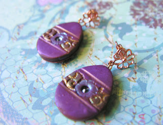
Spring and Easter Jewelry

The first day of Spring falls on my birthday this year so I suppose that it's natural for my jewelry to be so highly influenced by Spring.
Soft pastels reign supreme and many of my items have floral themes. Whimsical egg earrings have been inspired by fabrege eggs and are perfect for the upcoming Easter holiday. For the more fashion forward I have created handpainted pastel toned Chinese fan earrings and geometric pendants with sparkling beaded necklaces.

Here are some of my latest creations... Enjoy!


            https://www.etsy.com/listing/123431186/peacock-chinese-fan-earrings-with?


https://www.etsy.com/listing/123437991/flower-garden-pendant-in-blues-and?ref=v1_other_1


                https://www.etsy.com/listing/124955769/silver-gold-and-crystal-geometric?

What do you think of these photographs? It's a different look from my previous ones where I mostly used a slate tile for my  'backdrop'. White backgrounds are very popular on Etsy, but sadly they don't suit my jewelry very well. My luminescent surfaces become faded and unappealing when placed against such a bright backdrop.

What are some of your favorite things about Spring?

Wednesday, February 20, 2013

Backstage on a Runway Show

This post is the promised continuation of my last blog post about the recent wearable art runway show that I participated in. I'm sorry that it took so long but I had some technical difficulties in getting my video to upload.

Here are some backstage photos that I took as my fellow models and artists got ready to strut their stuff down the runway. I was truly in awe of all of the amazing talent that was there! Enjoy!


 Artist, Sandra Kuba, putting some last minute touches on one of her fabulous pieces.


'Untitled' by Sandra Kuba- silk and wool roving. fabric, trim and buttons

 
A detail of this piece. Look at all of the layers! Just beautiful!
 
'Untitled 2' by Sandra Kuba- asst fabrics.
Necklace, 'Midnight Fantasy' by Rachel Dugger


                                    A detail of that amazing skirt. LOVE the quilted cityscape!


'Untitled' by Barbara Stern- water bottle caps, beads, wire, bubble wrap, garbage bags, aluminum foil, paper clips, duck tape, styrofoam and paper fasteners

 
' My Inner Child' by Amanda Thompson - Astroturf, fabric, beads and paint
 

A detail of her fabulous coat. No idea how she managed to sew that stuff!
 
Putting the finishing touches on ' Sea Shore Evening Gown' by Veronika Koushal and Juliana Saez
 
 'Untitled' by Camila Gonzalez- black garbage bags, industrial Nagaland and soda can pop tops


             The back of this piece was really cool. Just loved the creativity!


Artist Sarah Buchanan puts the finishing touches on her model's makeup.


          'Untitled' by Shanley Mitchell- coffee filters

 
'Upon Further Inspection' by Shani Simpson- styrofoam plates, paper fasteners, tape, coffee filters, cardboard, dried beans and much much more.

 
'Dinner is Served' by Jackie Trufford- tablecloths, plates, silverware, wire and fabric.

 
Sarah Buchanan with her model. Her piece was entitled ' Natural Events' and was made using pewter, coral, bone and river grass


'Throw A Penny, Make A Wish'- hand-painted and distressed muslin, image transfers, plastic and pennies.


                           A detail of the front of my dress

 
The back of my dress
 
Here is the video that I created for this piece. Keep watching to the end because I included some footage of the runway show that a kind friend of mine took Great night!


There's also a great article that was written about it here.

I'm grateful that this project is over, but as with all creative ventures, there is a definite bittersweetness about it's finale as well. It was an amazing experience and one that I will never forget. However, I am definitely looking forward to being able to work on some new projects!

Which of the pieces is your favorite? Have you ever created a piece of clothing out of something unusual? What has been your favorite creative experience so far?

I look forward to sharing my next pieces with you soon! Have a great day everyone! <3

Saturday, February 16, 2013

A New Year, A New You

I recently attended a business lecture with Pamela Toussaint as the speaker. It was very facinating and extremely motivating. As Pamela is an image consultant, the main topic was branding, or creating your brand. I used to think of a brand as a company name or logo or something. As an artist however, my brand would be ME. This goes for anyone who is looking for a job. When you are applying to a company, you are essentially selling YOURSELF aka your BRAND. So what differentiates you from the crowd? What unique things can you bring to the table? Essentially, what is your unique value? I thought that I would take a moment to share some of the key points that were made.I found them to be inspiring and hope that they will inspire you as well.

1. You should be able to describe your brand in three words. What three words describe you? What sets you apart from everyone else with your degree or credentials?
2. The three things that a company will hire on are professionalism, high energy and self confidence. If you don't feel that you have some of these, then fake it till you make it. ;)

To create a compelling brand you must:
1. Discover what your passion is.
2. Differentiate yourself from others.
3. Engage others with similar interests.
4. Network! Most jobs aren't advertised. You often will find jobs through people that you either know or have met via networking. LinkedIn is a great networking tool!
5. Leverage. Make sure that people know about you. Speak at an event, write and article, keep a blog going, etc.
6. Evolve and stay current with new technology.
7. Create an action plan by taking steps to enhance your brand such as learning new skills. We should never be afraid or hestitant to learn, unlearn and relearn at all times.
8. Create a networking strategy:
         - Figure out a 30 second 'elevator pitch' for your brand that includes who you are, what your brand is and what you do for others.
         - Attend conferences, volunteer, networking meets, speak, host, etc

Here are some networking tips that she gave us:
         - plan ahead! research attendees if you can and figure out who you want to meet.
         - dress the part
         - arrive early. Most of the best networking happens before the doors even open.
         - do a visual self-check in a mirror beforehand and then enter the room with confidence
         - have a nice ice breaker comment
         - establish connection.( If you've researched people ahead of time then you can make this  
        connection easier as you'll know whether you have a same city, college or hobby in common.)

Part of my 2013 New Year's Resolutions is being more pro-active in my business. Pamela's advice has inspired me to reach these goals and to define my 'brand'. Have you already used some of these tips? What three words would you use to describe yourself or your brand?

Hope that this blog post has inspired you to take action as well! Have a wonderful week!!


Thursday, February 14, 2013

Happy Valentine's Day!!!

                                                               found on www.xavor.com


I'd share my last cookie with you guys. Love you all!  Happy Valentine's Day!!!

Tuesday, February 12, 2013

Wearable Art Runway Show

For the past five weeks I have spent over 200 hours working on a project for the Armory Art Center's Fashion Artillery Show. (a wearable art runway show) The theme of the show was Daydreams and Nightscapes. As I mulled over the two I decided to go with Daydreams. Daydreaming essentially consists of a person dreaming about the things that they might wish for. You might daydream about being famous, or beautiful, or rich, etc. Once I had taken it to this point, I began to ponder the ways that we might make a wish. (blowing out candles, wishing on a shooting star, etc) In the end, I chose the act of throwing a penny in a fountain and making a wish. As I often daydream about living in a bygone era, I chose a retro look for this dress. This is how my dress, 'Throw A Penny, Make A Wish' was born.

The Armory Art Center requires that you provide them with your idea and concept sketches in order for them to accept you into the show.


My initial sketches were quite rough. I originally intended to create the piece out of photographs. ( Photographs of things that people would wish for, mixed with photos of water)
A clear plastic with pennies would create an overlay.
As I contemplated the logistics of the dress, I came up with the idea of drilling holes in pennies so that I could lace up the back. Knowing that the weight of this dress would be considerable, I also devised a possible strap option if this should be needed.
 
 
My finalized concept sketch for 'Throw A Penny, Make a Wish'
 
Once my design was accepted into the show, the hard part began. I had to actually MAKE this piece. I also learned something that I hadn't known before. We would be required to attend a dress rehearsal as well as actually walking this piece down a runway. Once I knew that this piece had to last through essentially TWO shows, I decided to toss my original idea of working with paper. I have both worked with and worn paper clothing in the past and I didn't feel that this medium would last through two nights. While figuring out the actual logistics of this piece, I also didn't think that there was a way to make the paper sturdy enough to hold up the weight of the pennies. So I had to do some revisions to my design and decided upon muslin as my base medium instead. I chose this because it's essentially a blank canvas. My 'wish images' would be created using image transfers and I would create the watery look that  I wanted using paints.


The finished underdress pattern in muslin.
 
I thought that I would be able to drape my piece on a dressform,but couldn't find a dressform to borrow or rent in time. Therefore I had to create my dress by creating a flat pattern. It was essential that the piece be VERY fitted as I wanted it to be strapless and it would be carrying quite a bit of weight with all of those pennies.  I decided to model my own dress out of necessity. I didn't have a dressform, so to ensure that it would fit correctly, I had to be my dressform. It's sort of difficult to pin a dress when it's on yourself but somehow I managed it.
 

                                Once I had the dress fitting snuggly enough, I dismantled it so that I could begin creating the surface painting and transfers. I had never worked with image transfers in the past so I took great care to do alot of practice runs beforehand. I used gel medium for these transfers and found it to be a rather inaccurate science. Some transfers would come out quite well and others not so much... I created a fun ombre look using acrylic paints. It was exhausting painting so much material but I enjoyed having so much control. By handpainting the piece I could be very specific about where I applied the darker blues and where I applied my green and gold tones. To help give myself a more hourglass shape, I applied darker blues at my waist and hem so that those areas would recede to the eye.
 
The hardest part of this project was the pennies. I had originally thought that I could sew the pennies into the plastic with my sewing machine. I sandwiched the plastic with tissue paper thinking that this would help to keep it from sticking on my machine's feeders and foot. Sadly this wasn't the case. After much trial and error I came to the rather horrifying conclusion that I would have to sew all of the plastic components by hand.  So I creating a sewing pattern with the tissue paper, mapping out all of the sewing lines like a grid and began sewing the pennies in by hand.
 
 
After I finished the bodice pieces and added the muslin drape, I worked on the 'peplum'. (again by hand)
 
                                                       The finished dress and peplum.
                               
                                    My original idea of lacing up the back was kept. I had my dad drill some holes in the center of pennies so that I could lace up the back. I like the use of the pennies because it doesn't interrupt the flow of the top as traditional grommets would have.


To see some backstage photos from this show as well as some video from the runway show, stay tuned!! I'll be posting a continuation of this post tomorrow! Hope that you've enjoyed this post and have a great day!